My Sunday series on outdoor portraiture continues today with a twist. Starting today and in honor of Black Friday, all of the daily posts between now and next Friday will be about black and white, or monochrome photography, if you prefer.
Today’s Post by Joe Farace
“Color is descriptive. Black and white is interpretive.” — Elliott Erwitt
 The above quote by Elliott Erwitt summarizes my feelings about monochrome photographs, especially when it come to portraits. The lack of color simplifies an image, causing you to focus on the person who’s the subject of the photograph instead of their clothing or surroundings.
Monochrome Portraiture
I think black and white is a wonderful media for creating portraits because it produces a classic look. A black and white version of a color image that appeared on this blog received the second highest number of likes when posted on Instagram when compared to other portraits I’ve posted there.
Sometimes the nature of a portrait subject demands that the image be photographed in black and white. Arnold Newman’s portrait of composer Igor Stravinsky sitting at a piano could never have been made in color and have the same impact it has as a monochrome image. PS, the original 4×5 negative was cropped to create the dramatic composition.
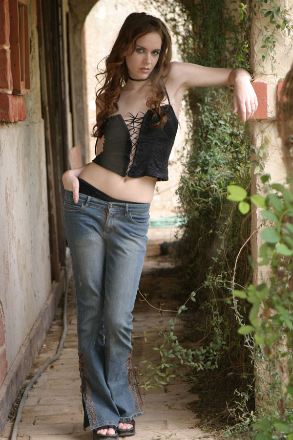
How I Made the Original (color) Portrait: At right is the original unretouched, unedited SOOC color file of Jessica who I photographed at a group model shoot in Arizona. It was made with a Canon EOS D60 and an EF 28-105mm lens (at 78mm) with an exposure of 1/60 sec at f/5 and ISO 200 with a minus (for some reason) two-thirds stop exposure compensation. An EX550 speedlite was used as fill. Overall, it’s a busy portrait with lots of distracting foreground and background elements.
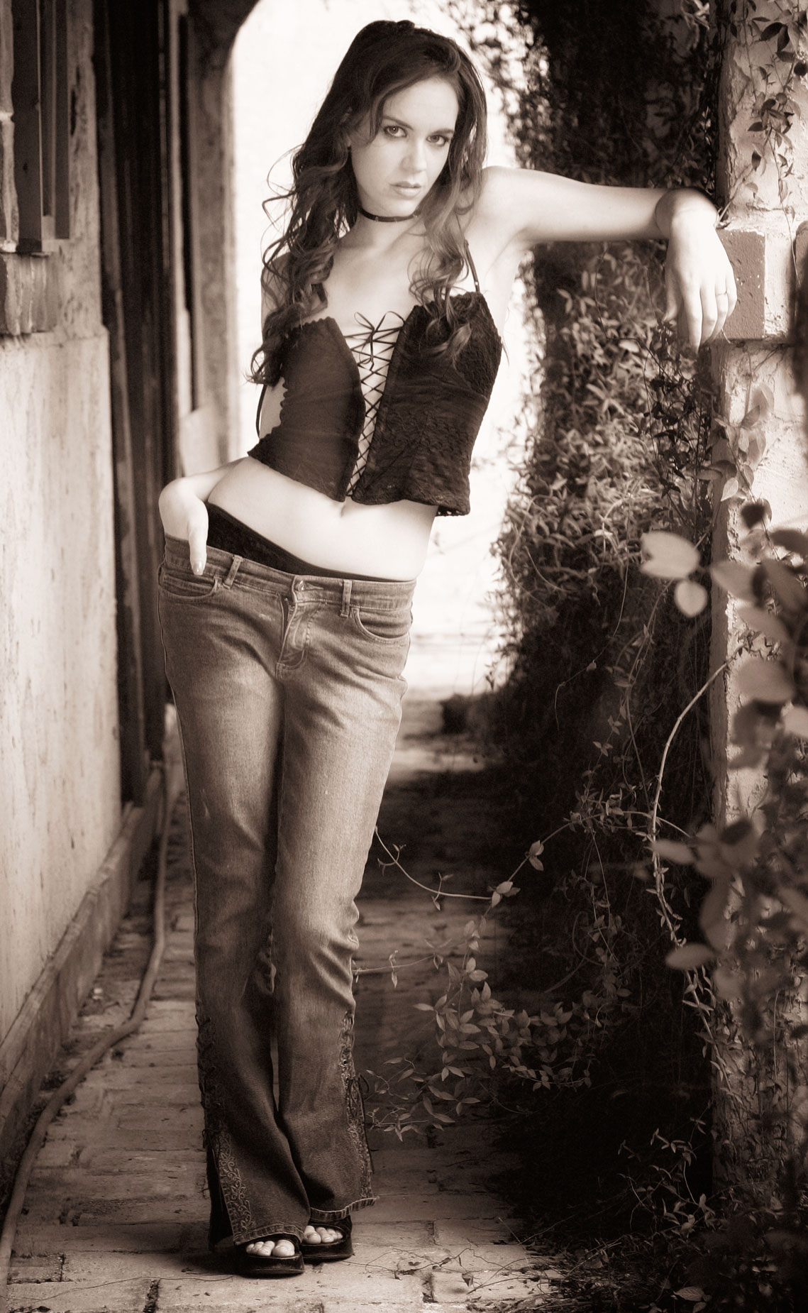
 How I Made the finished Portrait: Because of the slight underexposure, I compensated for the underexposure by applying my updated Correcting Underexposed Portraits technique. A color portrait is easier to retouch than monochrome file because there are so many more color tones to work with. That’s why it’s a good idea to retouch the image before converting to black and white.
The retouched color JPEG file (made before my current RAW+JPEG regimen) was converted to black and white using Exposure Software’s Exposure. I applied one of their black and white Cinema presets—Wizard of Oz—backing down the overall Intensity slider to 50% to keep Jessica from looking too much like Dorothy.
I think the finished (converted) monochrome image has more of a classic, nostalgic look and minimizes some of the clutter, such as the green hose laying on the ground behind her and puts the focus on the subject. It was converted to monochrome, not just black-and-white, since it has an ever-so-slight warm tone that’s reminiscent of Agfa’s Portriga paper that was popular back in my days of working in a traditional wet darkroom.
 If you enjoyed today’s blog post and would like to buy Joe a cup of Earl Grey tea ($2.50), click here. And if you do, thank so very much.
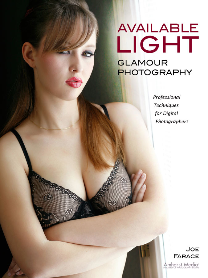
My book Available Light Glamour Photography that is available from Amazon with new copies selling for $29.95 and used copies starting around twenty-five bucks as I write this. Kindle copies are $28.07 for those preferring a digital format.