
Today’s Post by Joe Farace
“Let your words be few and your exposures many…”—anonymus
A histogram is a graphic representation of the distribution of exposure data in an image file. The idea behind histograms was originally conceived by Karl Pearson (1857-1936,) an English mathematician. Those who are mathematically inclined will tell you that a histogram is an estimate of the probability of a distribution of a continuous variable (like an image’s exposure.)
Looking at Histograms
A photograph’s histogram is a graphical representation of the tonal distribution in a digital image file, plotting the number of pixels for each tonal value. By looking at the histogram for a specific image file you should be able to judge the tonal distribution, the underexposure or overexposure, all at a single glance.
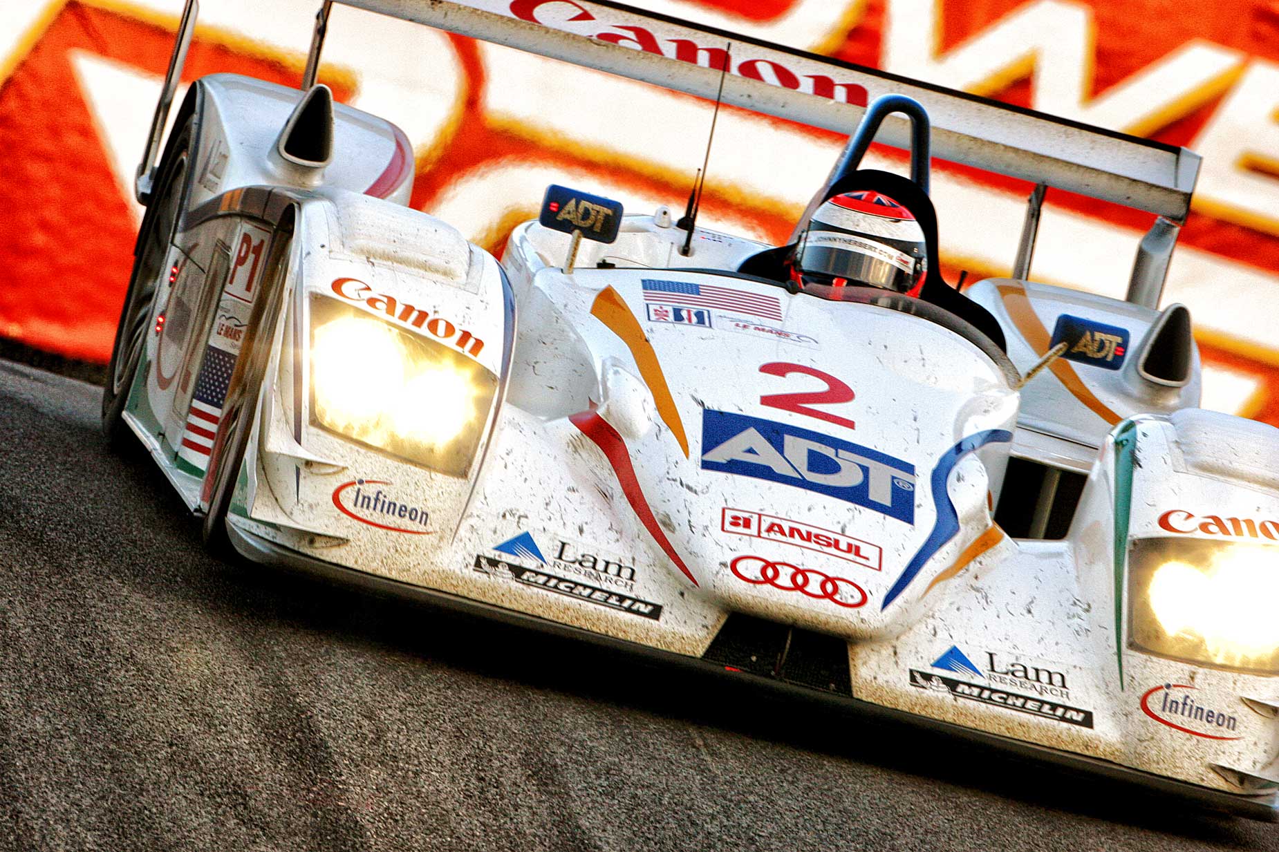
How I Made this Photograph: I made this (uncropped) image of an Audi America LeMans Series race car at Laguna Seca Raceway. Since this event. the series merged with the Grand-Am Rolex Sports Car Series to form the IMSA SportsCar Championship. The camera used was a Canon EOS 20D with a borrowed EF 500mm f/4.5 L USM attached to a hefty Manfrotto monopod. The exposure was 1/320 sec at f/9.0 and ISO 800 with a minus two-thirds stop exposure compensation.
A histogram’s horizontal axis indicates the level of brightness while the vertical axis indicates the pixel quantity for the different levels of brightness. If the graph rises as a slope from the bottom left corner of the histogram, then descends towards the bottom right corner, all the tones in the image should be captured.
 If the graph starts out too far in from either side of the histogram so the slope appears cut off, then the photograph is missing data and, in fact, the image’s contrast range may be beyond the camera’s capabilities to record it. When the histogram is weighted towards either the dark or bright side of the graph, detail may be lost in the thinner of the two areas. If highlights are important, for example, be sure that the slope on the right reaches the bottom of the graph before hitting the right side.
And then there’s this…
From all this mumbo jumbo comes so-called rules such as Exposing to The Right (ETTR) and counter arguments such as Exposing to The Left (ETTL.) My take on both of these tropes is that I ignore them. I don’t believe that in order to produce a perfect histogram you should be a slave to either of these rules. That’s because while the classic histogram features the famous bell-shaped (Gaussian) curve, not every photograph you’ll make fits this kind of exposure distribution. A high or low-key image will, more often than not, have a lopsided histogram. Does that mean that some exposure correction is needed? Nope, it just means that the histogram is appropriate for the image you just captured.

Along with Pulitzer Prize-winning photographer Barry Staver, I’m co-author of Better Available Light Digital Photography that’s available from Amazon for $24.50 prices with used copies selling for around seventeen bucks, as I write this. The Kindle version varies in price, for some reason/